⸺ Heeren Zerspanungstechnik is a family-owned machining company with decades of expertise. At a generational turning point, the company wanted to express both tradition and innovation.
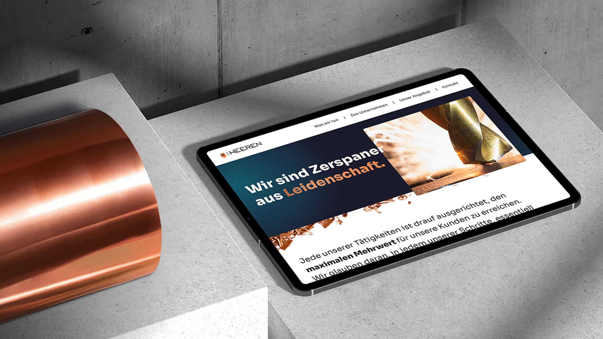
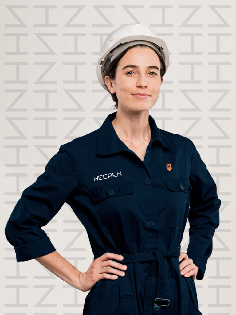
Challenge ⸺ Heeren Zerspanungstechnik, a family-owned machining company with over 26 years of experience, faced a generational transition as the founder’s daughter joined the leadership. The goal was to create a modern corporate design reflecting both technical expertise and passion—also to be showcased in the new office space.
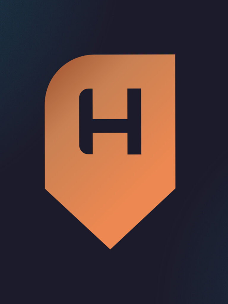
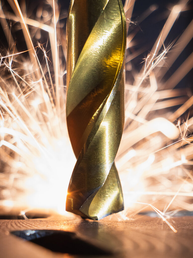
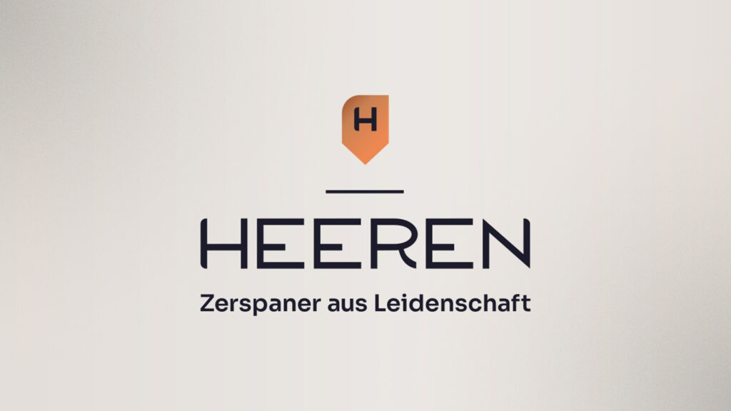
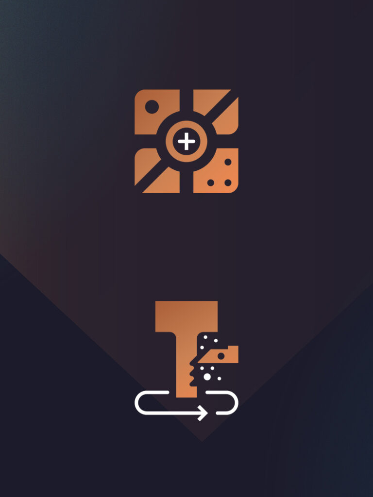
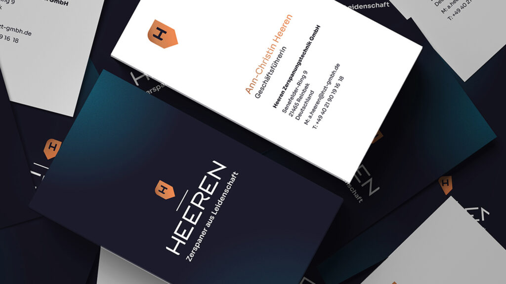
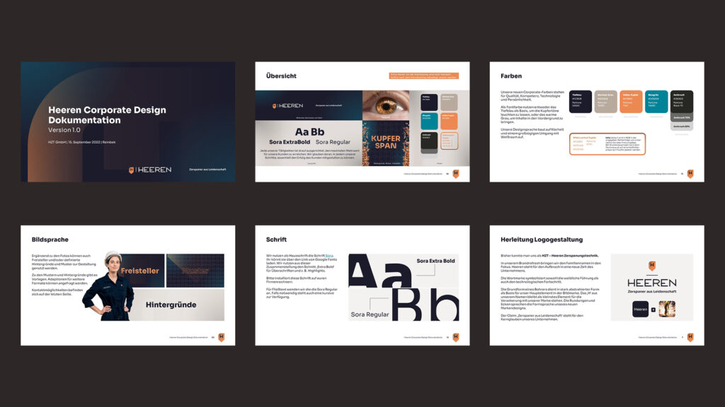
Solution ⸺ I placed the name “Heeren” at the center to highlight the change. The wordmark blends feminine elegance with technological progress, while the symbol abstracts a drill form. The “H” anchors the brand. A clean layout, ample white space, and a design guide ensured a modern look—complemented by stationery, templates, and a custom icon set.
⸺ Client
Heeren Zerspanungstechnik GmbH
⸺ My Roles
Creative Direction, Art Direction, Brand Design
⸺ Agency
K16